Case Study · Questrade
Customer account API
Naming a customer's account looks trivial, until someone holds two that both just say 'RRSP' and can't tell which is which. As Questrade grew into a full ecosystem, every product added another kind of account, and every team formatted it by hand. I turned account naming into a content rule precise enough to live in a backend API: one system that picks, live, the shortest unmistakable name for any account, on any screen. Built in a month.
Role
Principal Content Designer
Timeline
1 month
Team
Design-system UX manager, engineering lead, visual designer, content team
One account format, rendered consistently across Questrade's products and platforms
Challenge
Questrade was evolving from a single investing platform into a full ecosystem: high-interest savings, crypto, a prepaid card, each one a new kind of customer account. A customer account is the product container, a TFSA, Margin, RRSP, or HISA, and it shows up everywhere: dashboards, dropdowns, menus, and trade flows. When two of those accounts look alike, the stakes aren't cosmetic: a customer who can't tell them apart can move money into the wrong one, or give up and call support.
As the product lines grew, so did the inconsistency:
It surfaced as a message from an engineering lead:
"I have a concern with how we display accounts. I'm seeing different patterns: 'Self-directed Margin 12345678', 'Self-directed | Individual Margin 12345678', and more. Is there a standard we can push out to designers, the way we have a fixed way of writing a date?"
The goal was one scalable, automated way to display any customer account clearly and consistently, across every Questrade product and platform.
Discovery
The investing template already worked: Product type + Account type + Account number, validated with customers on mobile and web. The question wasn't whether it was usable. It was whether it could scale to every new line of business.
An audit of every account display
I audited every place an account appears, across cards, dropdowns, app bars, lists, and radio buttons, on every platform, then stress-tested the investing format against the four lines of business: investing, savings, mortgage, and insurance.
It held for investing, but new lines needed more variation, account numbers were formatted differently per line of business, and there were no rules for when to show the extra identifiers.
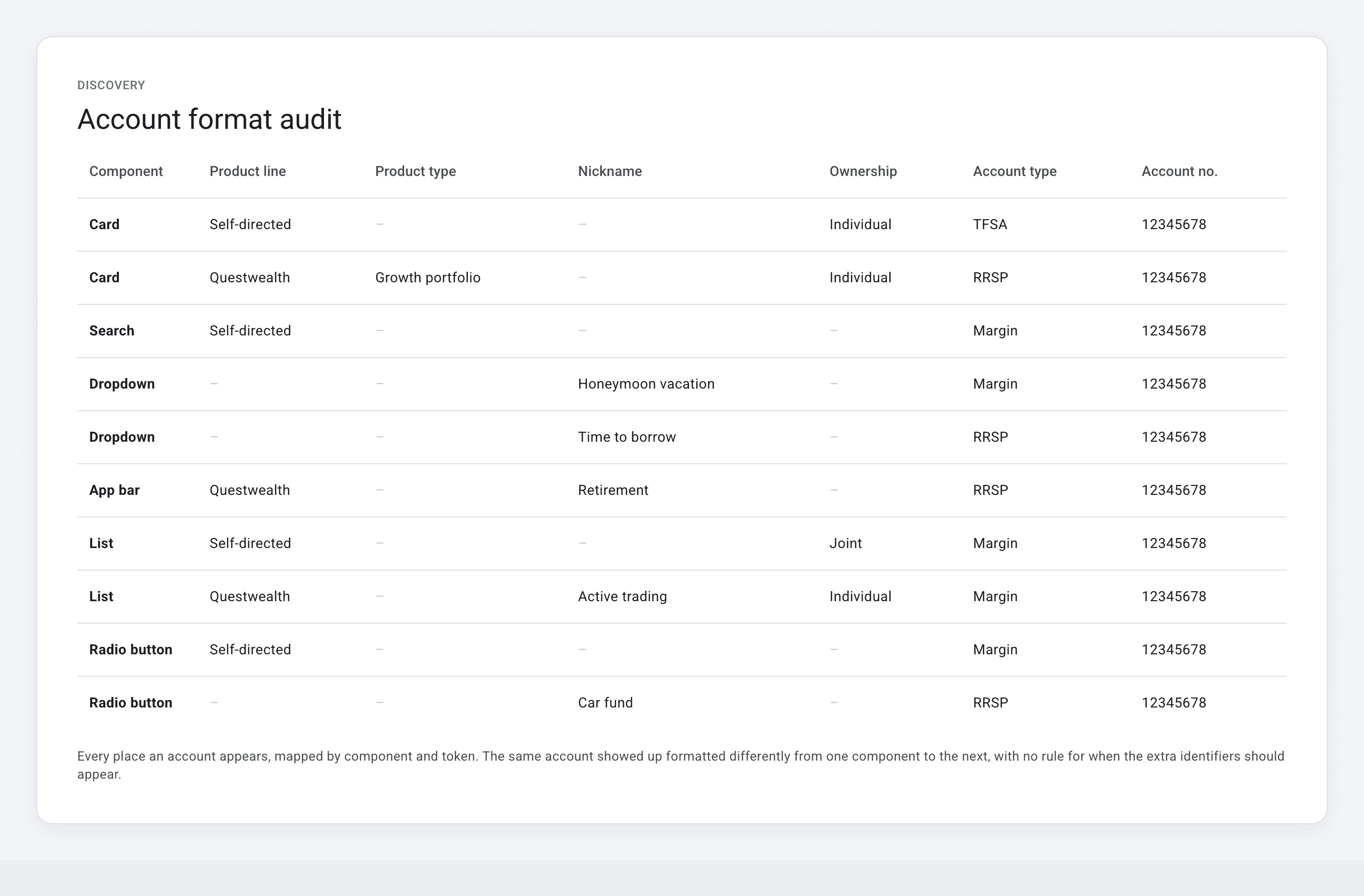
The account-format audit: every display instance, mapped by component, product line, and token, across every platform
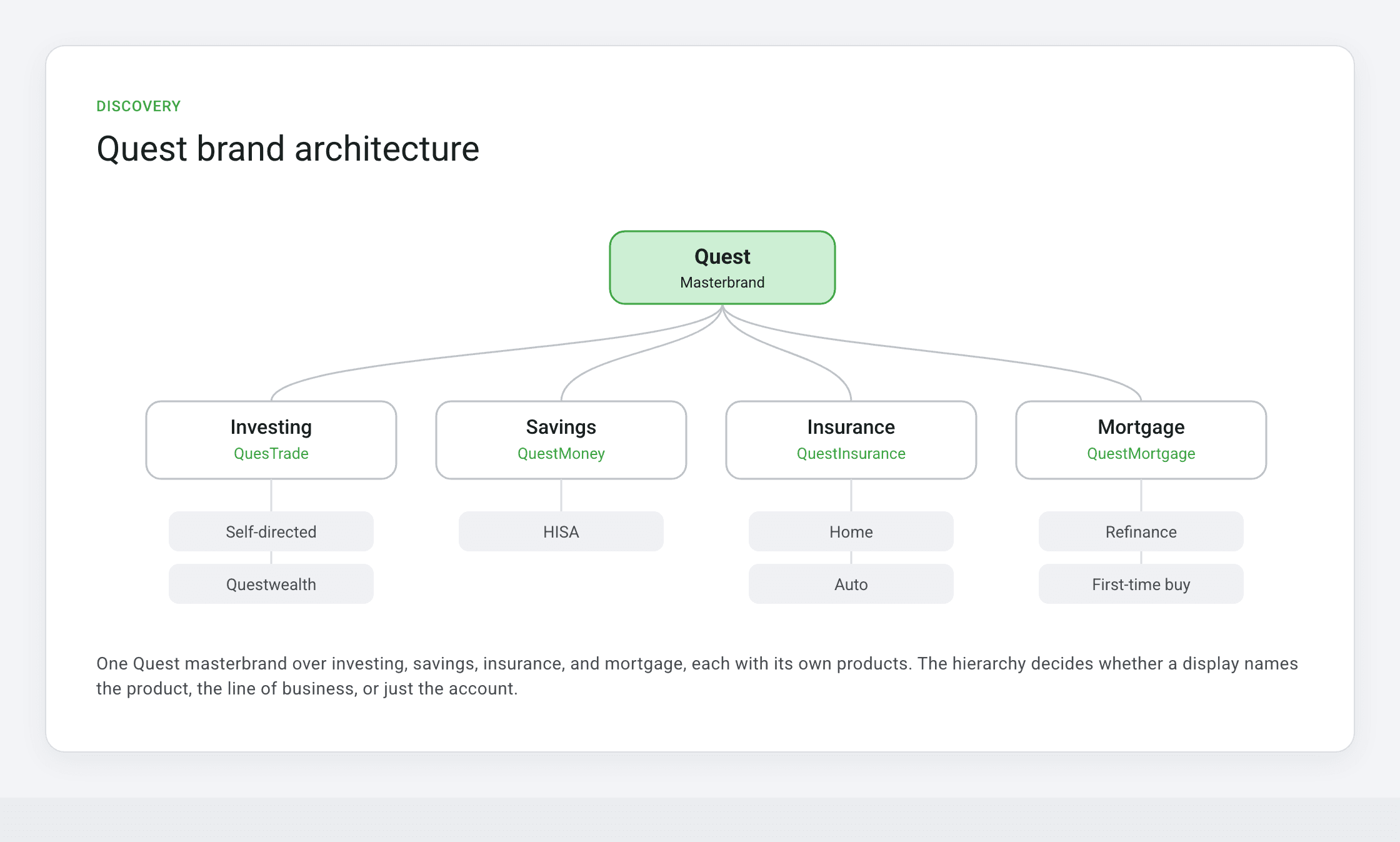
The Quest brand architecture: one masterbrand across investing, savings, insurance, and mortgage, each with its own products
Mapping the brand architecture
To know which label to surface, and at which level, I had to map the brand itself: a Quest masterbrand branching into investing, savings, insurance, and mortgage, each with its own products underneath. Without that hierarchy, there was no reliable way to decide whether a display should say the product, the line of business, or just the account.
A workshop to map the tokens
I led a workshop with the content team to map every token an account display could use. It found two required tokens that identify any account, a set of optional tokens for specific contexts, and one core flaw: the format didn't adapt to context. On a dashboard, customers need to see every account; during a deposit, their Questrade and external accounts; during a trade, only investing accounts. The format had to respond to context without losing clarity.
Guiding principles
Five principles set the bar for the system:
Clarity
A customer can identify their account at a glance.
Context
The format adapts to the UI and the business logic around it.
Consistency
Displays follow a repeatable, predictable logic.
Scalability
It works for every current and future account type.
Systemization
The logic aligns with component and design-system needs.
My approach
The team asked for a standard, a template designers could follow. My case, which I made when I first presented the work, was bigger: a static template would never keep up with a growing ecosystem.
We needed a system, and eventually an API that adapts each account display to its business and component context on its own. That vision set the three-phase path that followed: standardize the template, systemize it into a token model, then automate it in the API so no one would have to rebuild the logic again.
Phase one: Standardize the template
Because the investing format was already validated, I extended it rather than starting over. I defined the full template as an ordered set of tokens, two required and the rest conditional, and standardized casing, punctuation, and order:
Cobalt tokens are required on every account. The rest are conditional: shown only when they're needed to tell two accounts apart.
Then I mapped a display label for each line of business, and the rules for how the format behaves:
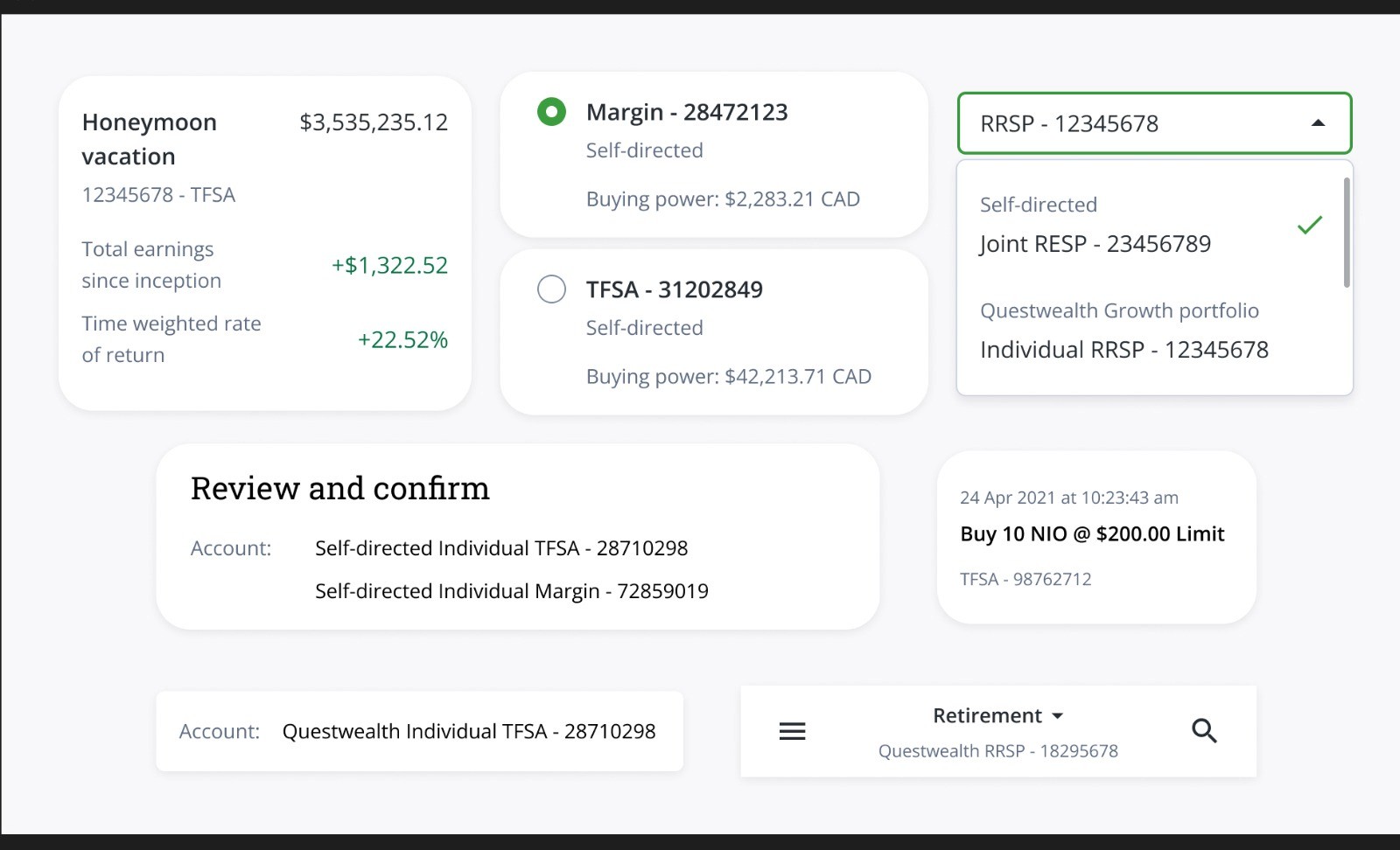
The template applied across scenarios: external institution, Questwealth, nickname, and short forms
Display rules
Phase two: Systemize the structure
I built a token model: seven tokens, each with a rule for when it shows. Two are always present; the rest appear only when they're needed to tell two accounts apart. That conditional logic is the whole system.
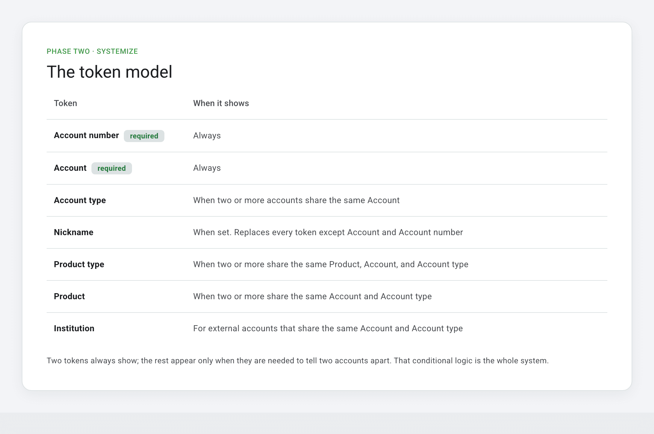
The token model: the seven tokens, and the rule that decides when each one shows
How components use it
Working with the design-system UX manager, I classified every Allspark component by how it should follow the format:
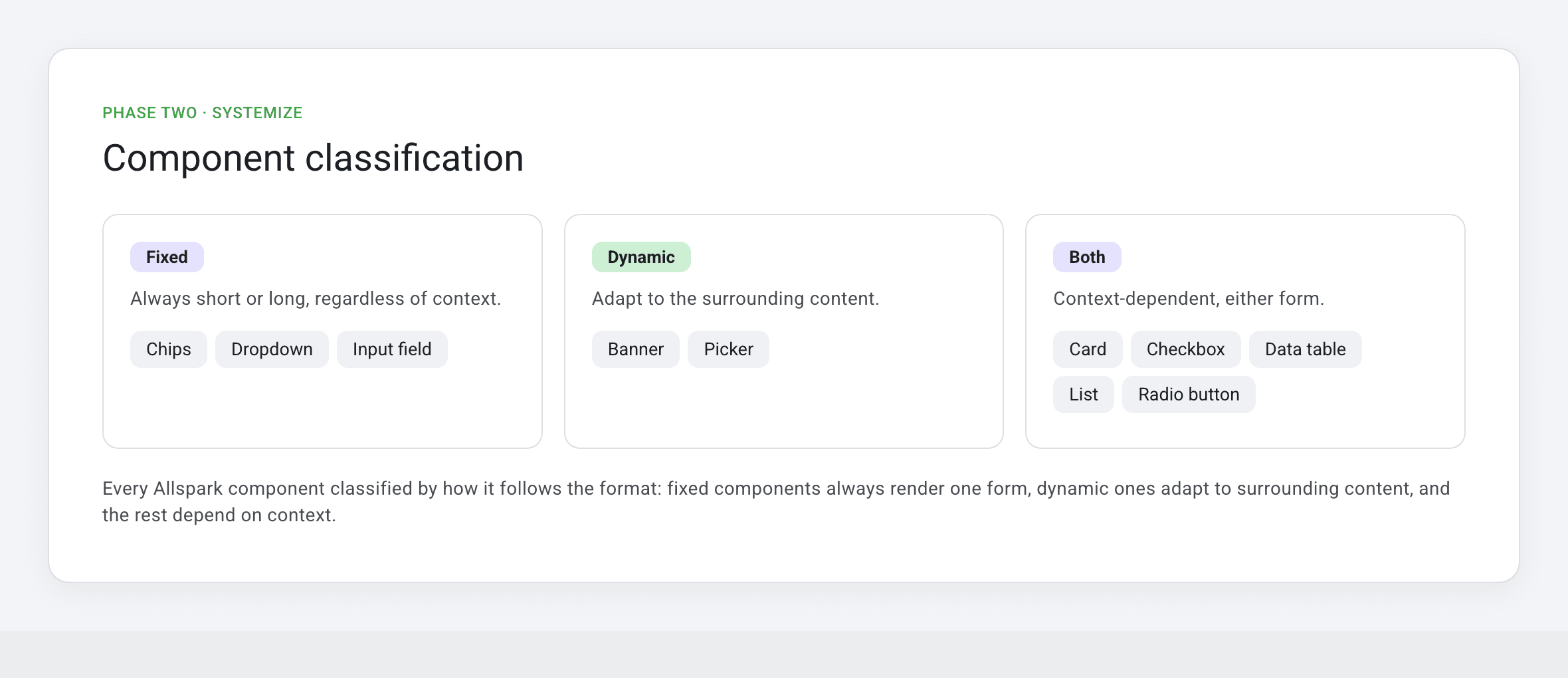
Component classification: fixed, dynamic, or both, and when each renders the short or stacked form
Phase three: Automate the logic
This is the reason it had to be an API and not a template. A template can format one account. It can't keep every account as short as possible, because the shortest unambiguous form depends on what else the customer holds. The same RRSP needs no product line until a second RRSP appears, so the right tokens have to be computed live, for each customer.
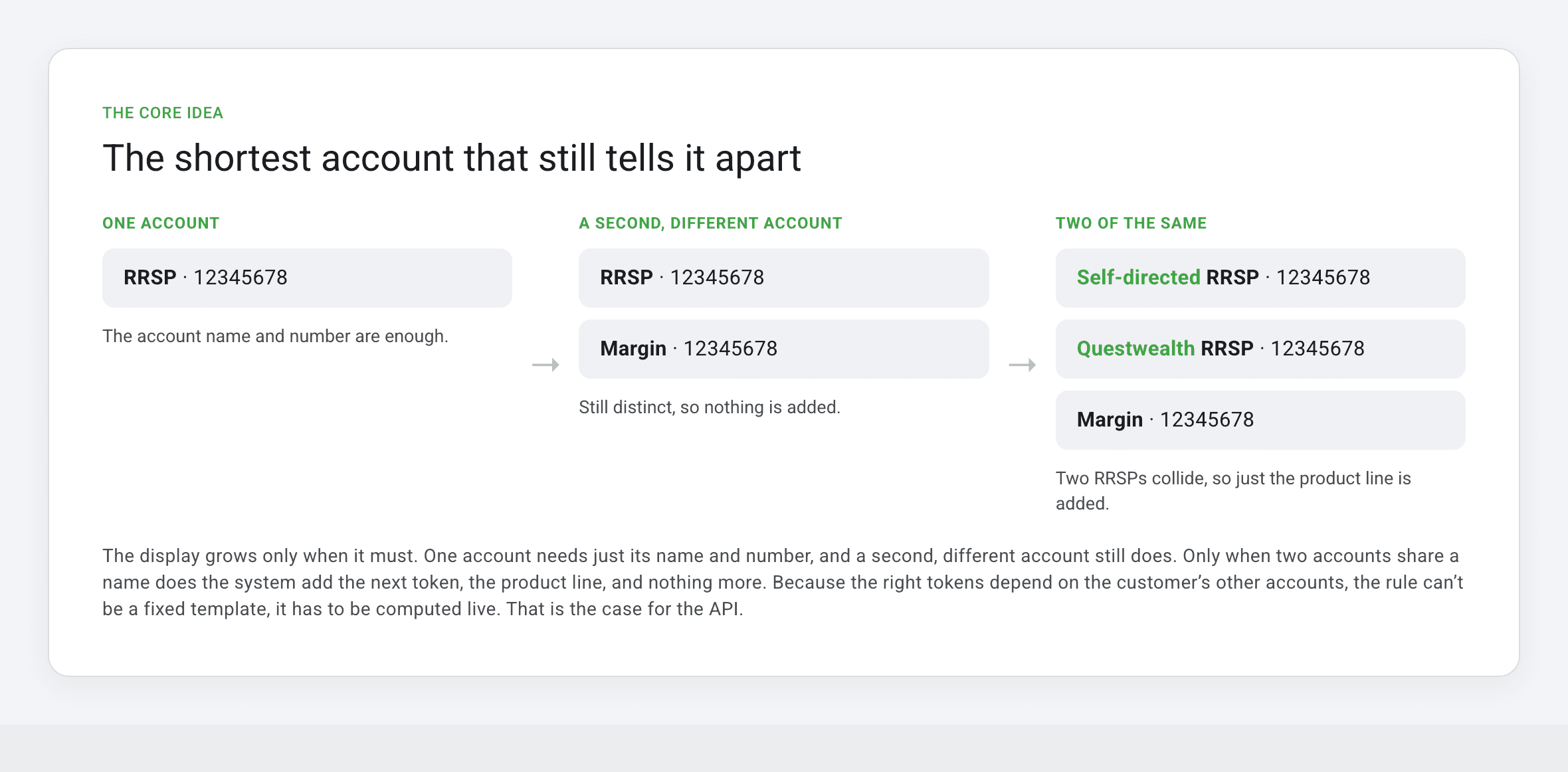
The display grows only when it must: the product line appears on the two RRSPs that would otherwise collide, and nothing more
So the logic had to live in the backend, not in every component. The architectural question I worked through with the engineering lead was simple to ask and hard to answer: components aren't smart, so which layer owns the smartness?
Owns the account information and the token rules that decide what shows.
Owns the business logic for the context the account appears in.
Owns only the design logic: layout and interaction.
So the token rules belong in the API, which picks the minimum tokens needed to tell two accounts apart, not the designer and not the component. Before, that copy was hardcoded in every component; after, the API serves it, and each component owns only how it looks.
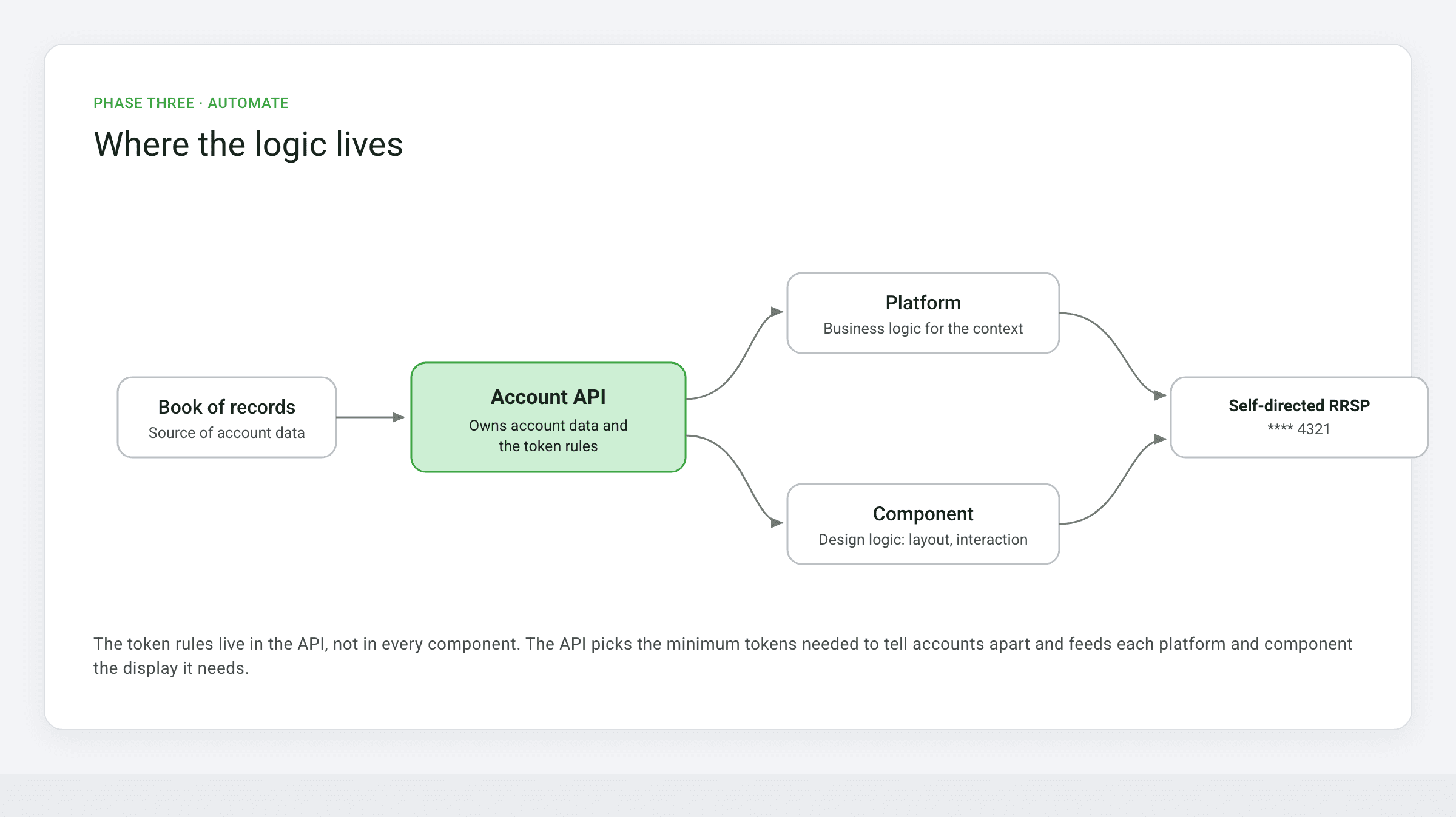
Before and after: the account-format logic moves out of every component and into the Account API
Outcome
The result isn't a style guide. It's infrastructure: one API-powered format that now displays every customer account across Questrade's ecosystem, using only the tokens needed for recognition and adapting to context on its own.
For customers, every account now reads the shortest way that is still unmistakably theirs, so they can act with confidence instead of second-guessing which account they're in. For the business, engineers and designers plug into one API instead of rebuilding the logic, the display stays consistent on every screen, and it extends to every account type Questrade adds next, all from one month of focused content work.
The API, live
Add a second RRSP and watch the API lengthen only the accounts that would otherwise read the same. Everything else stays as short as it can be.
Reflections and learnings
Most content design stops at Phase one: define the rule, write the guide, call it done. Some reaches Phase two: build a system and share it with designers. This reached Phase three, where the content logic was specific enough that an engineer could implement it as an API.
The content logic was specific enough that an engineer could implement it as an API. That is not a standard content design deliverable.
Getting there started with the reframe: arguing, early, that the answer wasn't a template but a system and an API. After that it meant knowing which fields were required versus conditional at the data layer, not just the display layer, and testing the model against the edge cases (overflow, truncation, minimum visible context) before handing it to engineering. This project taught me how to turn a content pattern into a system, and a system into a product, and it reinforced that user-centered thinking serves the internal teams who build the product, not only the customers who use it.
Kyle's candid and inquisitive nature makes him an invaluable collaborator. He takes full ownership of projects, diving deep into the background research and asking the critical questions others might miss. This attention to detail helps our team identify potential issues early and resolve them before they escalate.
Rachel, Sr. UX Researcher, Questrade