Case Study · Shopify
One-page checkout
Shopify was migrating every merchant to a new checkout, like it or not. I led the content for the rebuild: one fast page that had to convert better than what it replaced, or the move wasn't worth it.
Role
Senior Content Designer
Timeline
6 months
Team
Staff Product Designer, Product Manager, Engineer
Shopify's one-page checkout, on desktop and mobile
Background
Shopify Checkout powers roughly one in ten US online purchases, across hundreds of millions of buyers. It is also the surface a merchant can least afford to get wrong, because every point of checkout conversion is revenue.
At the time, Shopify was migrating checkout from an older technical foundation to a new one, and merchants would have to move regardless. That made the work two things at once: an opportunity to rebuild the checkout front end from first principles, and an obligation to make the move worth it. If we were asking every merchant to migrate, the new checkout had to give them something measurable back.
Challenge
The existing checkout had accumulated friction: too many steps, required fields that did not need to be required, dense instructions, and slow validation and transitions. On mobile, where most buyers were, it was worst. I helped rebuild it as a single, fast page without losing the reliability merchants depended on, as the front end of a migration no one had opted into.
Success came down to one number: at least a 2% lift in checkout conversion. That bar was deliberate. It was the threshold that justified the migration to merchants, turning a mandatory move into a clear win.
Discovery
Through data analysis, research, and merchant feedback, we identified four friction points, each pointing to a guiding principle that shaped the redesign.
My approach
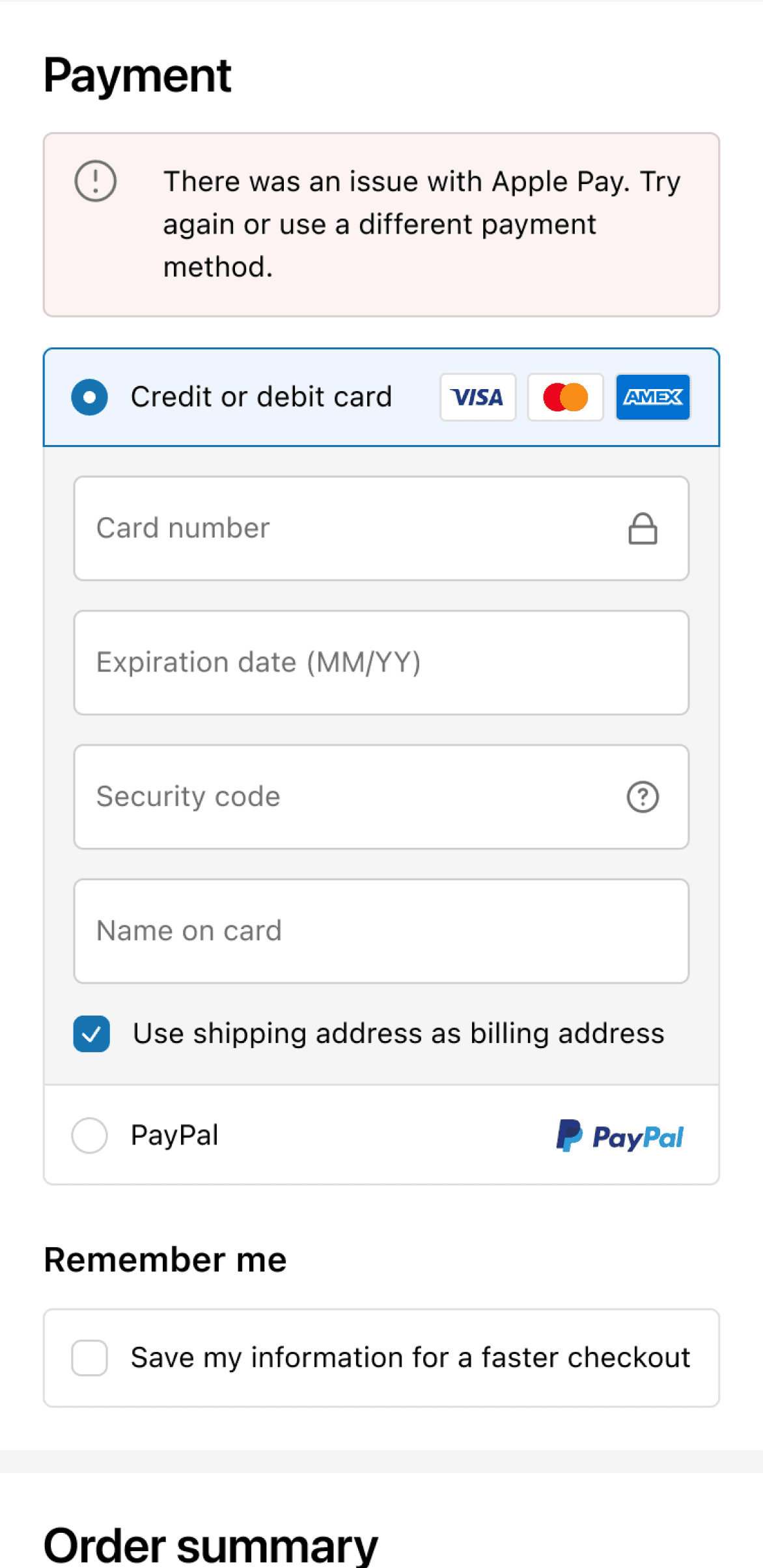
Streamlined user flow
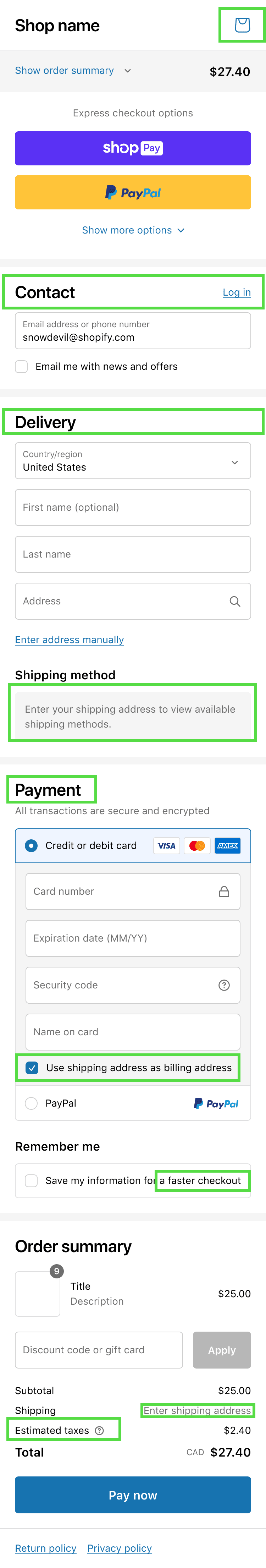
We consolidated the user flow into a single, linear page with a section for each key stage: customer information, shipping information, and payment information.
This meant fewer interactions and no page transitions, so customers could check out faster.


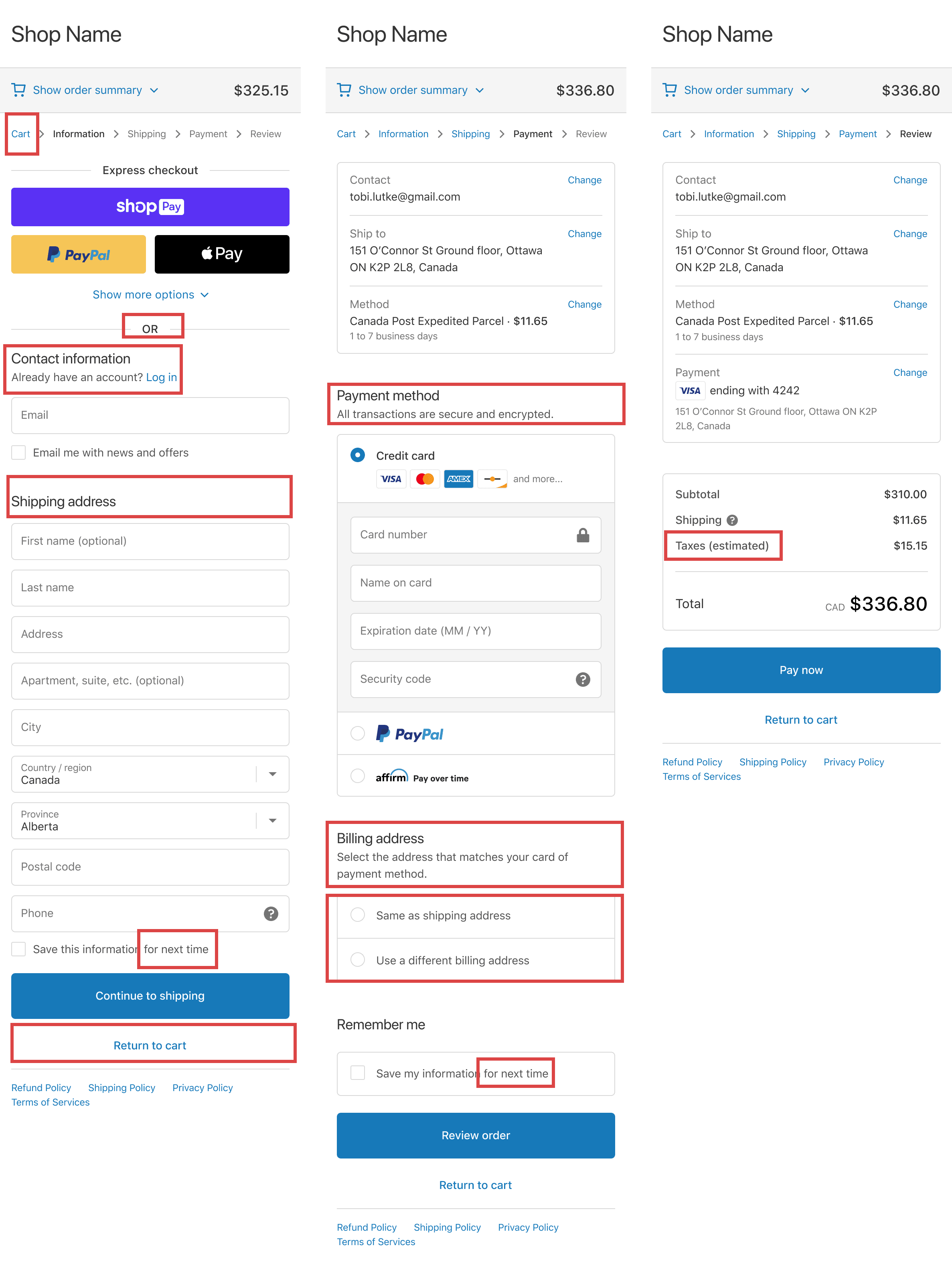
From a three-step checkout to one page
Vaulting and linked sections
To make a single page feel manageable, we built a vaulting system: known information collapses into roll-ups at the top, so buyers focus on what's left. Three rules kept it predictable: how sections are grouped, how they are ordered, and how linked sections move together.
Grouping
We split every section by what we know and what we don't. Review land holds known information, vaulted into roll-ups at the top. Task land holds what still needs to be collected, expanded below the roll-ups.
The roll-up variant followed the data. Details imported but not stored, like info from an external wallet, used a pre-filled roll-up. Details we stored, like a returning buyer's Shop Pay or customer account, used a vaulted roll-up.
Review land holds known, vaulted information; Task land holds what's still to collect
Ordering
Sections keep a fixed order within each land, and that order holds whether a section is vaulted or active. The page always reads the same way: email, delivery, shipping method, payment, then the order summary anchored at the bottom.

Sections maintain their order within Review land and Task land independently
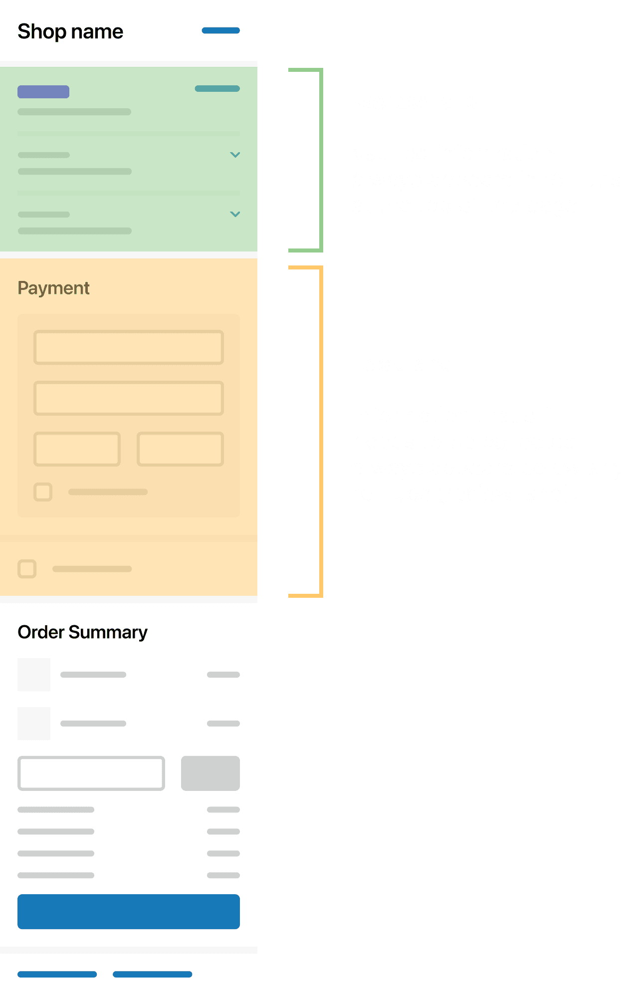
Linked sections
Some sections are paired because they share information. When one moves from Review land to Task land, its partner moves and adapts with it, and their order is preserved, so payment option always sits before payment method. Linking kept related steps together instead of scattering them as the page rearranged.
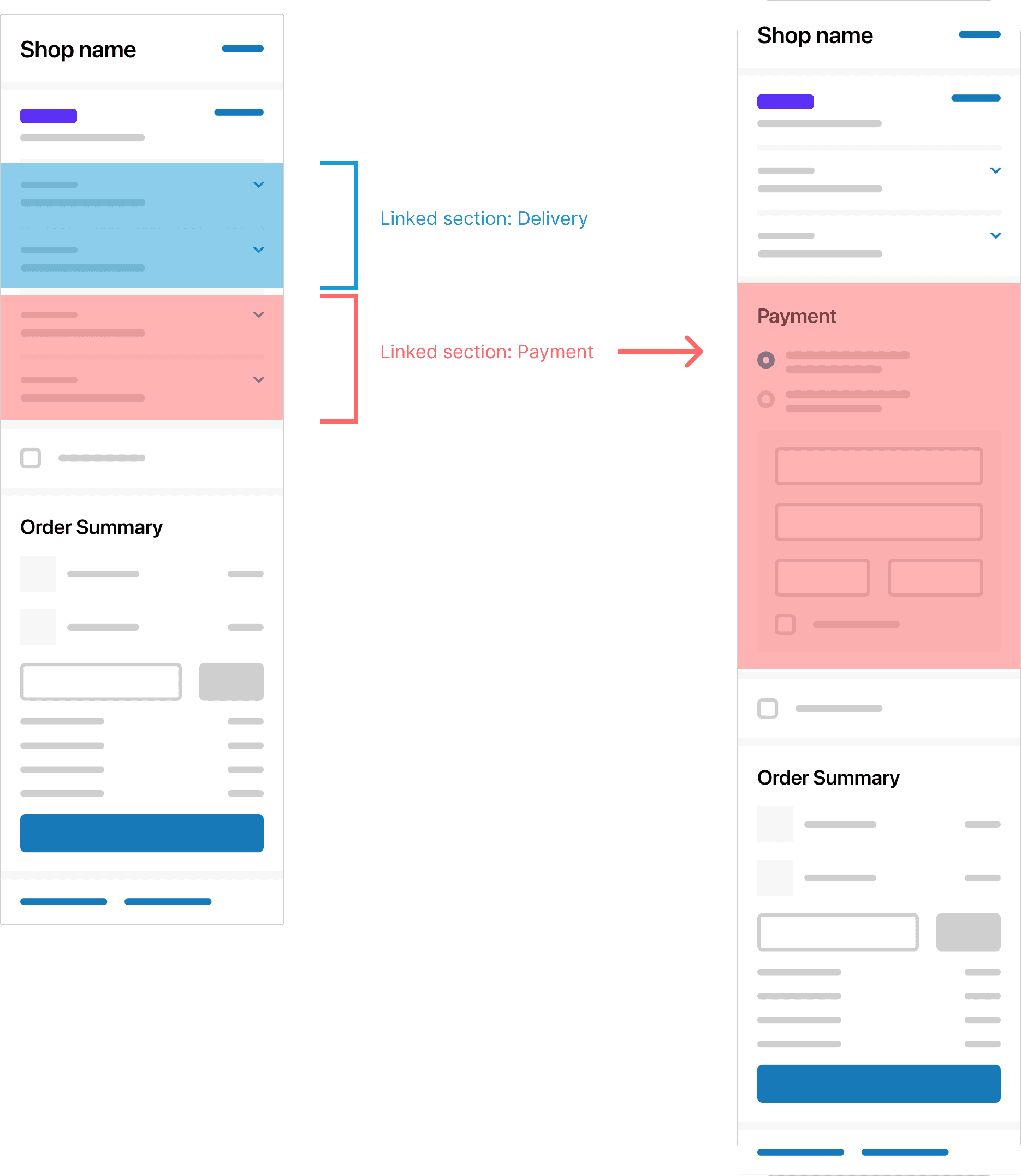
Linked sections move and adapt together, preserving their order
Copy refinement
Following our principles, I adapted all content to the new single page design:
·Removed and consolidated redundant copy
·Made labels and static messages clearer
·Reviewed and refined changes based on feedback from weekly content crit meetings and A/B testing
Red marks redundant copy in the original multi-page checkout; green marks tighter copy in the redesign
Clear messaging
I audited and updated all in-app messaging to enhance usability and align it with content guidelines.
I documented these updates in the checkout design libraries and buyer-facing design system, ensuring consistency for users and efficiency for Shopify's teams.
To make the content scalable, I built reusable content templates documenting the rules for each component: title, body, image, and CTA. They let the team produce consistent dynamic messaging across the checkout.
The templates also documented format rules. For example, CTAs follow a Verb + Noun pattern, and "checkout" is the established M2B term.

Template anatomy: the rules for each component

The template applied to a price-update message
The payoff showed up in checkout's dynamic moments, when something in the cart changed. The same templates explained inventory issues clearly: out of stock, quantity changes, price changes, and mixed states.

Inventory messages built from the same templates
Error messaging
Most errors in checkout are validation errors. Where a field could be checked as the buyer typed, it was, so problems surfaced before they reached submit. Everything else validated on submit with a full-page check.
I scoped each error to its blast radius: a field-level message for a single input, a section-level banner when a whole section was affected, and a page-level banner that summarised multiple errors and scrolled the buyer to the top. The smaller the problem, the quieter the message.
Triggers
Completion: triggered when required information or selections are incomplete.
Validation: triggered when entered information or actions are invalid.

Trigger map: each field checked for completion and for format
Messages
Field-level error
Use case: An error applies to a specific field, and immediate feedback is possible.
Behaviour: Highlight the field and show an error message directly below to guide users.
Behavior

Example

Field-level error: highlighted input with inline message
Section-level error
Use case: The error impacts an entire section.
Behaviour: Show an error banner at the top of the relevant section for easy visibility.
Behavior

Example
Section-level error: banner at the top of the affected section
Page-level error
Use cases:
·The error affects the entire page.
·The error is located further down the page, and it's critical for the user to notice.
·Multiple validation errors across the page need summarising.
Behaviour: Show an error banner at the top of the page to ensure key information isn't missed.
Behavior

Example
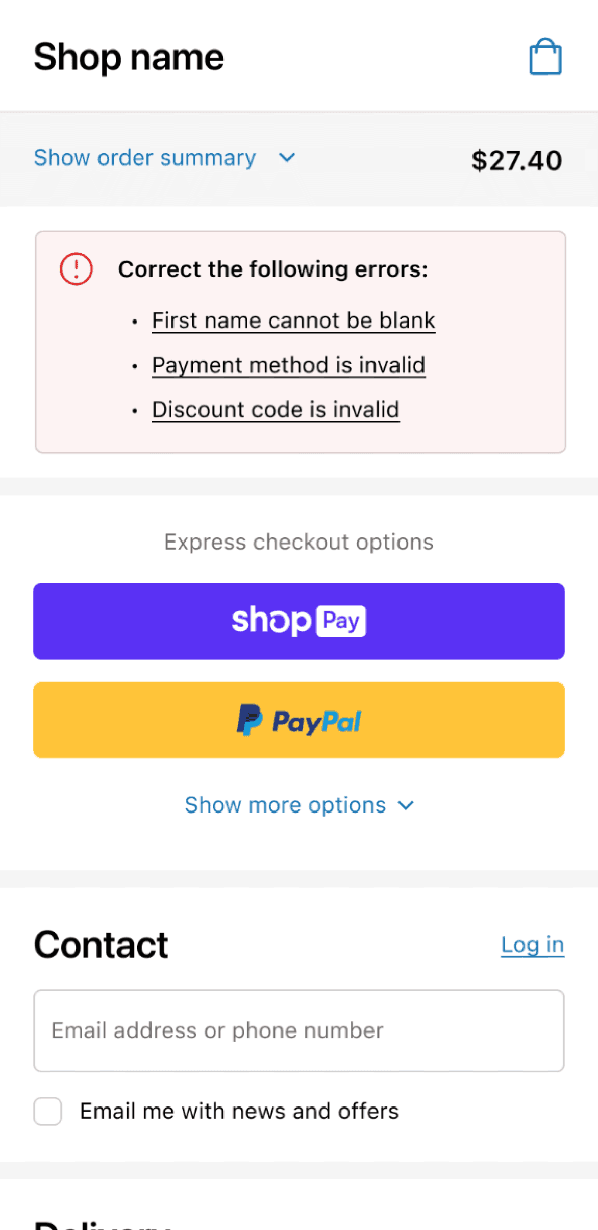
Page-level error: banner at the top surfacing all critical errors
Connection messaging
Connection errors are harder. A network interruption mid-purchase is the worst case, so I led the content strategy for how checkout tells buyers what's happening and what they can do about it.
I started with the words. "Network" is too abstract for most buyers, so I standardised on "internet connection." Then I matched the response to severity. A full-screen offline modal was the obvious fix and the wrong one: it's jarring on mobile, and Shopify's guidelines reserve toasts for short, non-critical messages.
Transient drop
A momentary connection issue that won't last long. Checkout shows a toast and leaves the form in place, so buyers can keep going: "Your network is unavailable, sit tight while we try to reconnect."

Connection unavailable: a toast for a momentary drop, with the form left in place
Persistent loss
When the connection stays down, checkout is effectively offline. We deactivate the form so buyers can't lose their work, and say plainly that checkout is offline until the connection returns.

Connection fully offline: the form is deactivated to protect the buyer's work
Critical failure
When the problem blocks the whole page, like Shopify's network being down, a banner carries the message. It's never buried in a toast, so buyers always see what's wrong.

Shopify's network is down: a banner for a blocking, page-level failure
Design system
As the lead content designer across the three checkout teams, I maintained the content standards in the buyer-facing component library. Each component shipped with a spec covering its usage, states, content rules, and accessibility, so messaging stayed consistent across teams and new work was faster to build.
The library spanned everything from checkboxes to banners. The examples below show a few of the library's components.
Working with accessibility specialists, I made sure each component met accessibility best practices, from clear labels and logical focus order to large enough touch targets, so checkout worked for assistive technology by default.

Banner

Checkbox

Accessibility spec
Mobile
We adopted a mobile-first approach to reduce user frustration and simplify the checkout process. For example:
·Enhanced button touch targets and added autofill to minimise user effort and speed up form completion.
·Designed conditional logic for prefilled fields: for example, the cardholder name shows an X button only when prefilled, so users can clear and re-enter without confusion.
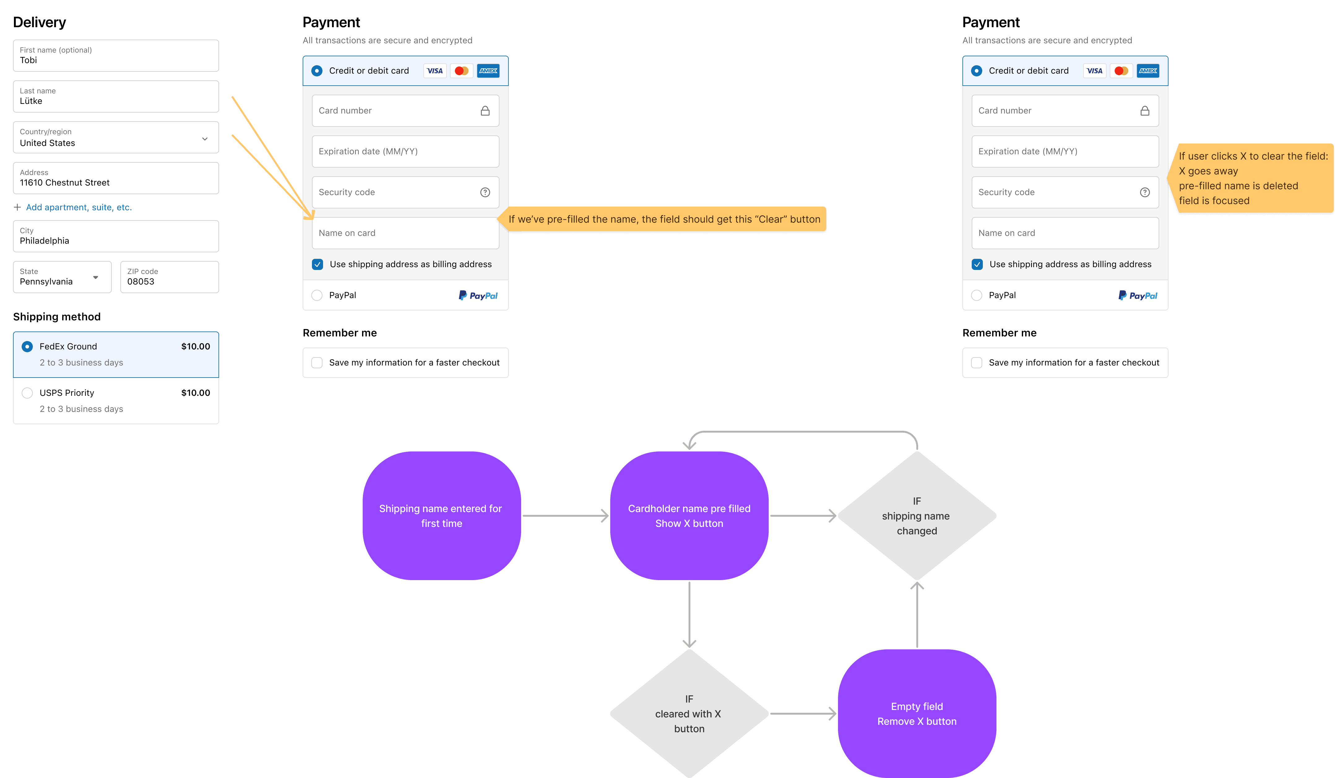
Cardholder name prefill: conditional clear-field logic on mobile
Rollout: a migration merchants would accept
Shipping the design was half the job. Because the migration was mandatory, the rollout had to earn merchant trust, not just announce a change. I helped shape the merchant comms for a phased release, structured so the bar was always met before the audience widened.
·Limited validation: prove the experience in production with a small group before widening the audience.
·Pre-GA waves: distinct messaging for merchants who had opted in versus opted out, and for treatment versus control groups.
·General availability: gated on proof that one-page checkout lifted conversion. Only once the numbers held did we tell every merchant their checkout was about to change.

Notice: checkout will update soon, with the option to switch now
Opted in: now using one-page checkout

Automatic: still on three-page checkout, updating at GA
Aligning content across teams
Keeping checkout coherent meant keeping people aligned. As the content lead across three checkout teams, and a consultant to every buyer-facing product team, I kept content decisions shared through weekly crits, regular reviews with stakeholders, merchants, and engineers, and one documented source of truth for standards.
That is what let a single voice scale across the whole checkout. Teams shipped faster because the decisions were already made and written down, and buyers got one consistent experience no matter which team built the surface.
Results
The goal was at least a 2% lift in checkout conversion, the threshold that justified the migration to merchants. The redesign did not just clear that bar. It blew past it.
The live one-page checkout in action
A mandatory migration became a clear upgrade. The new checkout shipped as Shopify's default, now serving thousands of merchants globally, and became the world's highest-converting checkout. You can try it live.

Performance: Shopify converts up to 36% better than competitors (Shopify benchmark study, 2023)
Reflections and learnings
Simplicity for the buyer is complexity someone has to own. The single page only feels effortless because vaulting, error scoping, and connection handling all agree on the same rules underneath. Most of my work was deciding those rules and writing them down, so three teams could move fast without the page quietly drifting apart.
That is the real lesson: content design's leverage lives in the system and the language, not the screen. A CTA pattern or an error tier looks small in a review. Shipped across every buyer-facing surface, it is what holds the experience together. The decisions that survived were the ones we documented, not the ones we settled in a meeting and forgot.
A mandatory migration changes the job. When merchants have no choice, shipping is not enough. You have to give back something measurable and earn the right to their trust with each phase. That constraint made me sharper about what "done" means: not the launch, but the moment the new checkout was clearly better than the one we took away.
If I did it again, I would build the content system first, not last. The templates and component specs gave us the most leverage and arrived too late to save us the most rework. I now treat the system as the starting point of the work, not its byproduct.
Kyle was instrumental in building and launching Shopify's one-page checkout. His strategic insights and ability to simplify complex problem spaces allowed us to tackle challenges efficiently, making a significant impact on the product's success.
Nadya, UX Manager, Shopify