Case Study · Questrade
QuestMobile account balances
Only 15% of investors could tell how much they actually had to trade with. I redesigned QuestMobile's account balances so first-time investors could read their money at a glance, and trade with confidence.
Role
Principal Content Designer
Timeline
3 months
Platform
iOS and Android
Team
UX Designer, UX Researcher, Product Manager
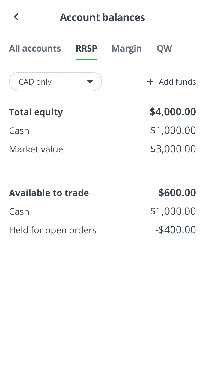
QuestMobile: the redesigned account balances screen
Background
Questrade is one of Canada's largest online brokerages, helping people invest through its Self-Directed Investing platform across web, mobile, and desktop. To reach a new wave of first-time investors, Questrade launched QuestMobile, a native app built for people newer to investing.
Account balances sit at the center of that app. It is the screen a customer checks before every trade. On the web platform it was also the screen that confused people most, so getting it right on mobile was a priority from the start.
Challenge
On the web platform, the account balances table confused customers. They could not reliably tell how much money they had available to trade, which led to rejected orders, lower transaction values, and a steady stream of support calls. Left unsolved, the same problems would follow customers into QuestMobile.
The redesign had three goals: make the table intuitive enough for a first-time investor to comprehend, give people a clear read on the funds they could actually trade with, and cut the support burden the old table created.
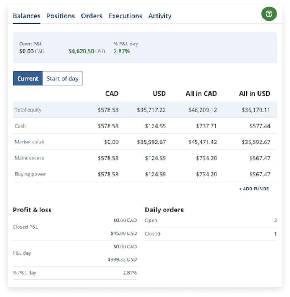
The existing account balances table on the web platform, before the redesign
Discovery
Before designing, we needed to understand the users and exactly where the table lost them.
The user
We anchored on a novice-investor persona: someone trying to grow their savings and build financial knowledge, who struggles to read their balances and hesitates to trade when they are unsure what they can actually spend.

Journey mapping: where novice investors lost confidence in the balances flow
Evaluative research
I guided a mixed-methods study to find where the table broke down. In cognitive walkthroughs, participants narrated their thinking as they read the table, surfacing the exact terms that confused them. A task-success analysis then measured whether people could tell if they had enough funds to place a trade.
The headline finding: only 15% could correctly identify whether they had enough funds (their Buying Power) to make a trade.

Term-comprehension audit: where the original labels broke down
Internal signals
With the Customer Experience and Customer Support teams, we confirmed the scale of the problem: a high volume of calls about account balances, and customers voicing the same confusion on social media.
Guiding principles
The findings pointed to three principles that steered every design decision.
Reduce cognitive load
Simplify how information is presented so users can process and understand it at a glance.
Improve clarity
Use clear, industry-standard language so novice investors can confidently read their balances.
Test in a targeted, iterative way
Zero in on novice-investor pain points and validate every iteration, so each version answers a real, measured problem.
My approach
Content model and low-fidelity design
I started with the most common account for novice investors, the margin account, and built a content model for the table with the UX designer. The old layout put total equity on top and available funds far below, in non-industry labels. I regrouped the table to show all balances, the calculations behind them, and how they relate, replacing jargon with descriptive labels.
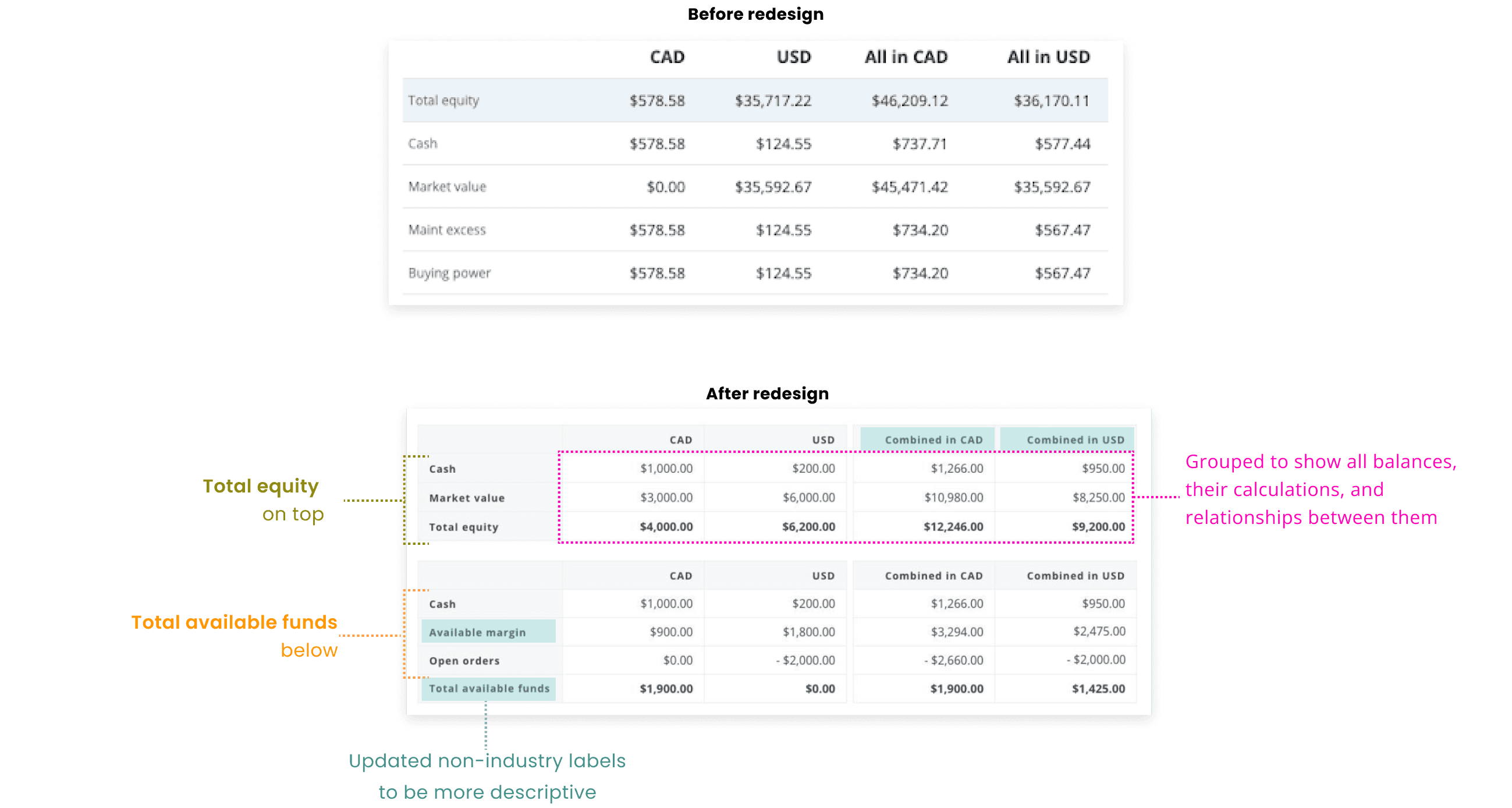
Low-fidelity prototype: the restructured account balances table
A concept-validation round with 13 participants confirmed the direction: 91% could now tell whether they had enough to trade, up from 15%.
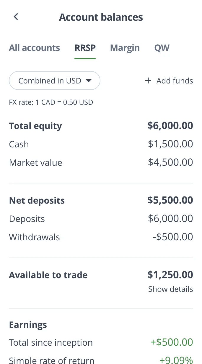
Mapping every account type
For the high-fidelity design I audited every term in the existing table, then mapped use cases across account types, all accounts, margin, registered (RRSP), and Questwealth, so the language stayed consistent in every scenario. I added the underlying values that show how each balance is calculated, making the relationships between figures transparent, and aligned all terminology with industry standards.
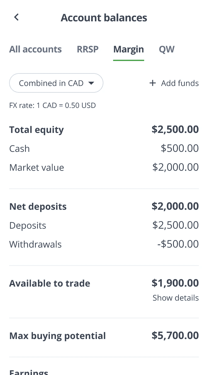
Interaction design: one currency at a time
To cut overwhelm, we segmented balances by currency so customers see one view at a time: CAD only, USD only, or combined in either currency. Within each view, I grouped balances into a logical build, so the numbers add up the way people expect:
·Assets owned
·Deposits and withdrawals
·Funds available to trade
·Earnings

Before: every currency in one flat list

After: segmented by currency, grouped by intent
Iterative testing
We ran three rounds of usability testing, a 15-person pilot, a 13-person full study, and a 14-person follow-up, refining the content, UI, and interactions each time. Participants switched between account types and currency views, so each task tested both comprehension and interaction.
Round 1
Round 2: currency segmentation
Round 3: refined hierarchy
Final design
We set the bar before testing began: 85% comprehension, 85% task completion, and a satisfaction rating of at least 4 out of 5.

Round 2 results: comprehension by term

Round 3 results: clarity gains across balance types
By the third round we had cleared every target
·88% comprehended key values and terms (target 85%)
·87% of tasks completed successfully (target 85%)
·85% used the currency and account-type controls without confusion
·4.3 out of 5 average rating for usability and clarity (target 4)
An educational glossary
Industry-standard terms like "buying power" are precise but unfamiliar to new investors. Rather than strip the language down, I added an in-app glossary that explains terms on demand. The app could teach the vocabulary instead of avoiding it, keeping the content accurate while still meeting novices where they were.
Results
The redesigned account balances shipped with QuestMobile, serving more than 200,000 investors. A clearer table did not just read better. It changed behavior.
The drop in order rejections was the most direct signal: customers stopped trying to trade with money they could not actually use. Higher average order value followed for the same reason. Once people could see what they had, they invested more of it, with confidence.
Reflections and learnings
For first-time investors, clarity is the product. A balances table that reads clearly is the difference between a confident trade and a rejected one, and content hierarchy, deciding what someone sees first, is what delivers it.
The sharpest lesson was about rigor. We set our success metrics during usability testing rather than at kickoff. Defining them up front would have anchored every decision to a measurable target from day one, and it is how I run projects now.
The glossary also reframed how I think about jargon. The goal is not to remove industry language but to teach it, so customers grow into the terms instead of being shielded from them.
Kyle's candid and inquisitive nature makes him an invaluable collaborator. He takes full ownership of projects, diving deep into the background research and asking the critical questions others might miss. This attention to detail helps our team identify potential issues early and resolve them before they escalate.
Rachel, Sr. UX Researcher, Questrade