Company
Shopify
Role
Senior Content Designer
Team
Staff Product Designer
Product Manager
Engineer
Timeline
18 months
Challenge
To stay competitive in the global e-commerce market, Shopify developed a strategy to improve the overall experience and performance of its checkout.
Our objective was to create a more user-centred checkout that would increase conversion rates by at least 2%.
Discovery
Through data analysis, research, and merchant feedback, we identified key pain points and opportunities to improve the checkout experience:
Checkout length: Too many required fields and pages frustrated customers, leading to drop-offs.
Complexity: Excessive instructions, messages, and interactions distracted customers, increasing the likelihood of abandoning their purchase.
Speed: Slow validation and page transitions made customers impatient, resulting in drop-offs.
Mobile-first: Most customers were shopping and checking out on their mobile devices, and frustrations with mobile interactions highlighted the need for a seamless mobile experience.
Guiding Principles
The discovery insights informed our guiding design principles:
Make checkout shorter
Make checkout easier
Make checkout faster
Optimise for mobile
My Approach
Clear messaging
I audited and updated all in-app messaging to enhance usability and align it with content guidelines.
I documented these updates in the checkout design libraries and buyer-facing design system, ensuring consistency for users and efficiency for Shopify's teams.
Modals: Inventory issues
Error system
We worked as a team to investigate and document all validation errors and their triggers. The Staff Product Designer and I then mapped these triggers in the context of the new one-page design.
Together, we designed an error message system with clear guidelines to ensure that only essential error messages were displayed in context, helping users self-correct while increasing checkout speed and limiting drop-offs.
Triggers
Completion: Triggered when required information or selections are incomplete.
Validation: Triggered when entered information or actions are invalid.
Messages
Field-level error
Section-level error
Use case: The error impacts an entire section.
Behaviour: Show an error banner at the top of the relevant section for easy visibility.
Page-level error
Design system
As the lead content designer for all checkout teams, I ensured that buyer-facing design system guidelines were maintained and aligned across all product design work.
This consistency upheld quality standards between the three checkout UX teams and other product teams.
Mobile and accessibility
We adopted a mobile-first approach to reduce user frustration and simplify the checkout process. For example:
Collaborated with accessibility experts to ensure every element (e.g. text, buttons, and input fields) was optimised for small screens and met accessibility best practices.
Enhanced button touch targets and added autofill to minimise user effort and speed up form completion.
Autofill: Cardholder name
Team alignment
To ensure alignment across products and teams, my team led regular check-ins and feedback sessions with stakeholders, merchants, and developers.
As the lead content designer for multiple UX teams, I also consulted on content standards for all buyer-facing product teams. I documented and shared updates regularly through Slack and in weekly stand-ups.
This helped to bridge gaps between teams, achieve business goals, and meet user needs.
Solution
The final one-page checkout design was fast, intuitive, and optimised for mobile.
Key improvements
One-page flow: Reduced interruptions, increased speed
Clear messaging: Enhanced usability, reduced errors
Mobile performance: Larger touch targets and autofill reduced drop-offs
Results
One-page checkout exceeded performance and business expectations:
4x faster checkout completion
91% increase in mobile conversions
56% increase in desktop conversions
96% customer rating
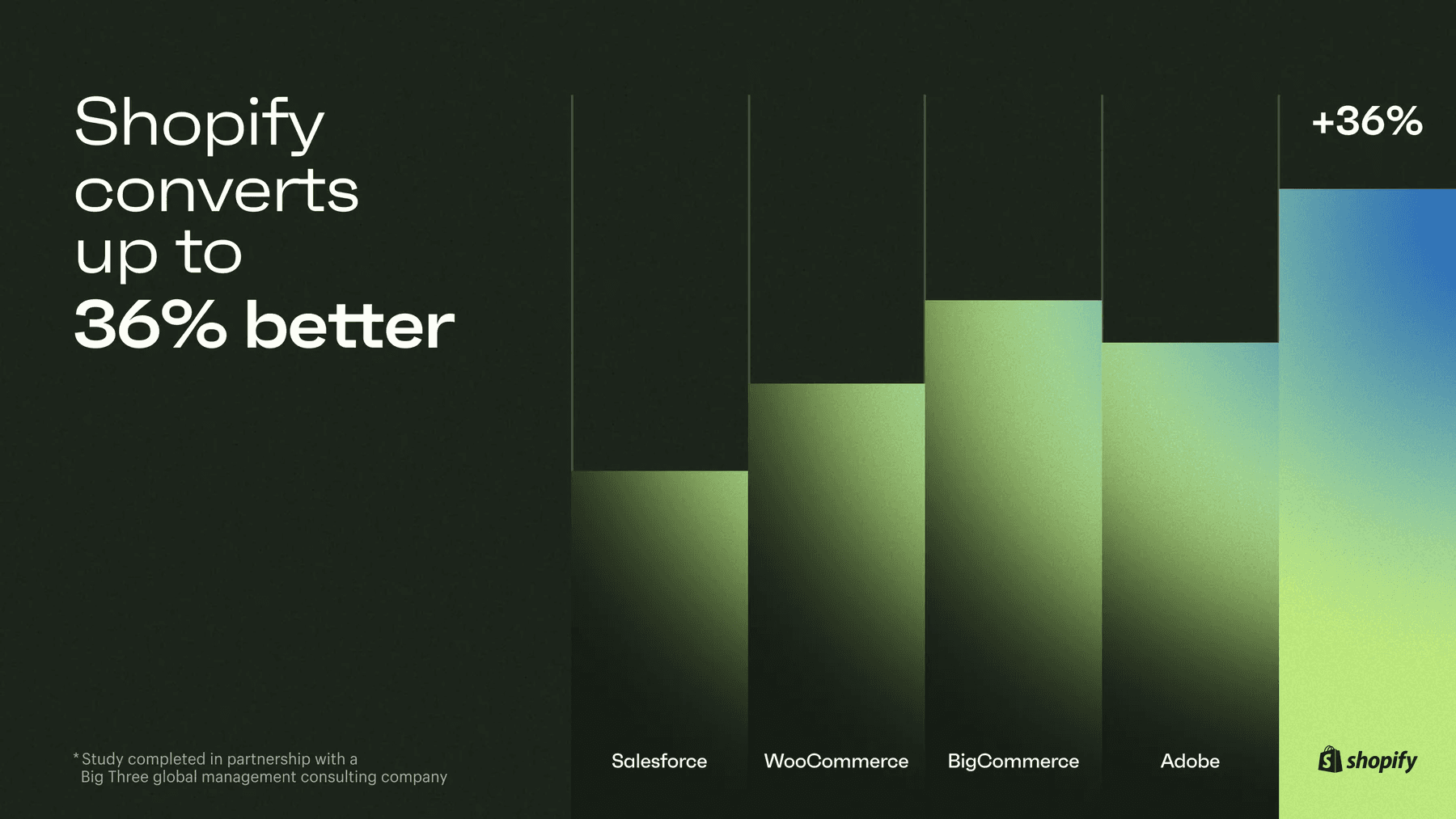
It's now Shopify’s default experience for thousands of merchants globally, and the world's highest-converting checkout.

Reflections & Learnings
This project reinforced the value content design can bring to users and the business through systemisation and clear, efficient communication.
It taught me the value of communication and documentation in leading cross-functional alignment, ensuring all teams were moving toward the same vision to make checkout better for our users.
I continue to apply these principles in my content strategy, UX writing, and leadership work to reduce friction for users and stakeholders at every touchpoint.
“Kyle was instrumental in building and launching Shopify’s one-page checkout. His strategic insights and ability to simplify complex problem spaces allowed us to tackle challenges efficiently, making a significant impact on the product’s success.”

Nadya
UX Manager | Shopify


